The Lost Cover
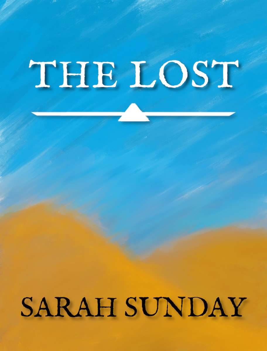
Although I am not that close to fully finishing The Lost I had the motivation to finish the E-Cover for it. I can’t do the print cover as I don’t know the final page count nor the dimensions I will be choosing for it, so that will be a separate post.
It came together relatively easily. Mostly because this wasn’t the first cover I had made for The Lost. I made a cover years ago, but the license of the font and image was dubious, so I had to remake it. But the aesthetic/concept of the cover remained the same: sort of old looking text against a picture sand dunes.
The font is IM FELL English Pro by Igino Marini. It was an easy lock. The text placement & font remained the same through my attempts as you’ll see below.
I could have found a photo of some sand dunes, but that felt tacky. And my drawing skills have improved recently so I decided…why not draw my own cover art? I was doing it recently for other bits of the book. So I did, and it turned out pretty well, but it did have a few iterations to get to the final version.

The first I was almost going to go with, but there were a few issues: the blurring/smearing by the edges of the hills (it was messy) and the hill definition.

The second attempt has the back hill with a starker hue and improved edge smearing. I didn’t like the hills as much.
Then it was pointed out to me that the shapes were…kind off off. So I changed the shape and below is the pure art of it:

More of a sloped hill, more definition, and better smearing. It just clicked and works and thus the final cover is:
I’m pleased with it! It’s simple and to the point. Stands out from my other books as The Lost…stands alone.
Related/Recent Posts
The Lost Print Copy
Finally The Lost in print form! It’s a slim 6x9 copy. The interior margins were too tight to the spine for my liking so I’ve adjusted it going forward. It is now up for purchase now on Lulu. I’m pleased with it. {% include image-gallery.html gallery=page.general %}
The Lost RELEASED!
The Lost, my first ‘novella’, is finally done. After…like seven years of not really working on it, but always knowing I would, it is finally done. It feels good. I haven’t worked on / gotten the print copy yet, so that will be forthcoming.