Commissioned Art of Hequera!
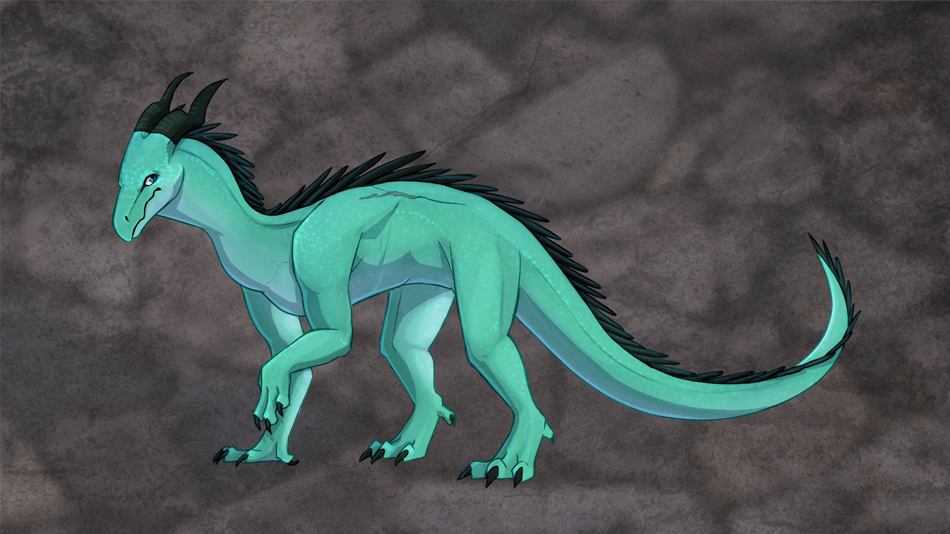
Since I commissioned Haasio for Dien, it was only apt I did so for Hequera as well. It was natural and expected. The end is known in the beginning…but in this case the beginning is known in the end. Hequera was an easier commission to rationalize in many ways since Dien had already been done and Hequera was going to be less complicated (mostly by nature). The general shape was constant between them with some adjustments. Hequera’s color was more of a green/blue teal hue, she was going to be meeker in pose, and perhaps a little bit thicker. And, of course, no wings but she had the scars from them. Plus, she has back spines, unlike Dien. I was also planning on doing no fancy background, but as you’ll see…I changed my mind.
Sketches
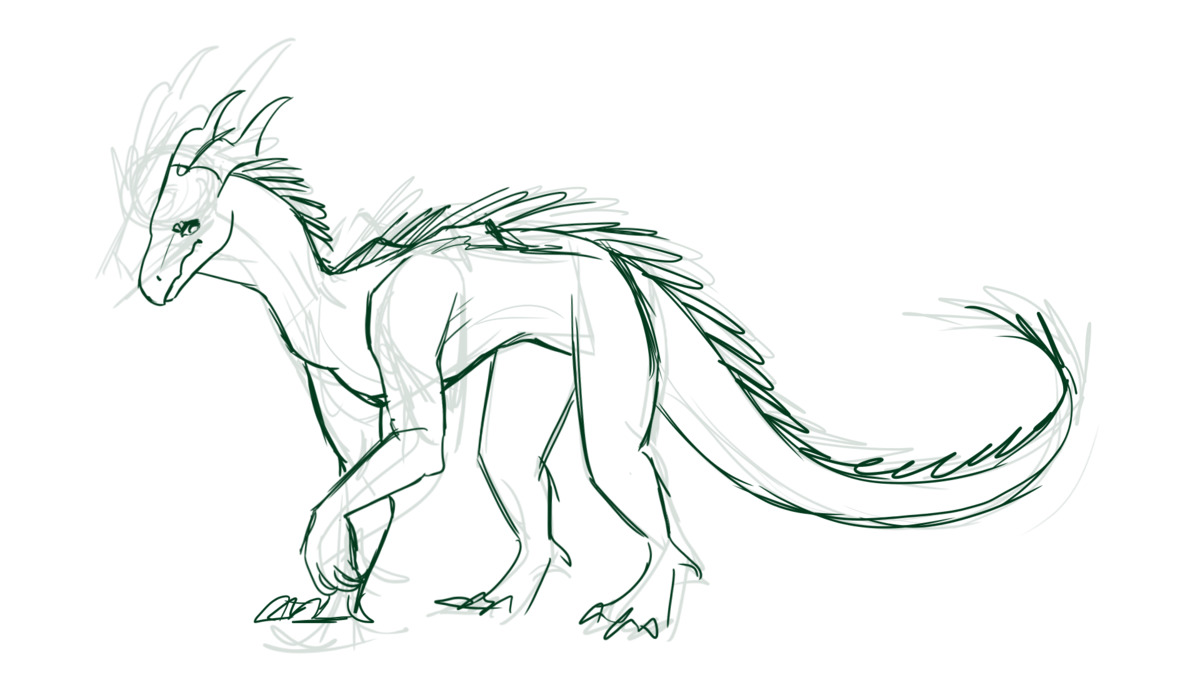
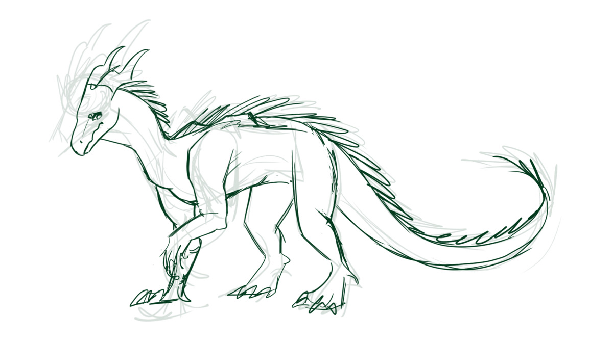
The initial sketches were on point. She was a bit thin the first go so I asked to make her belly lower and her overall shorter.
Color, Shading
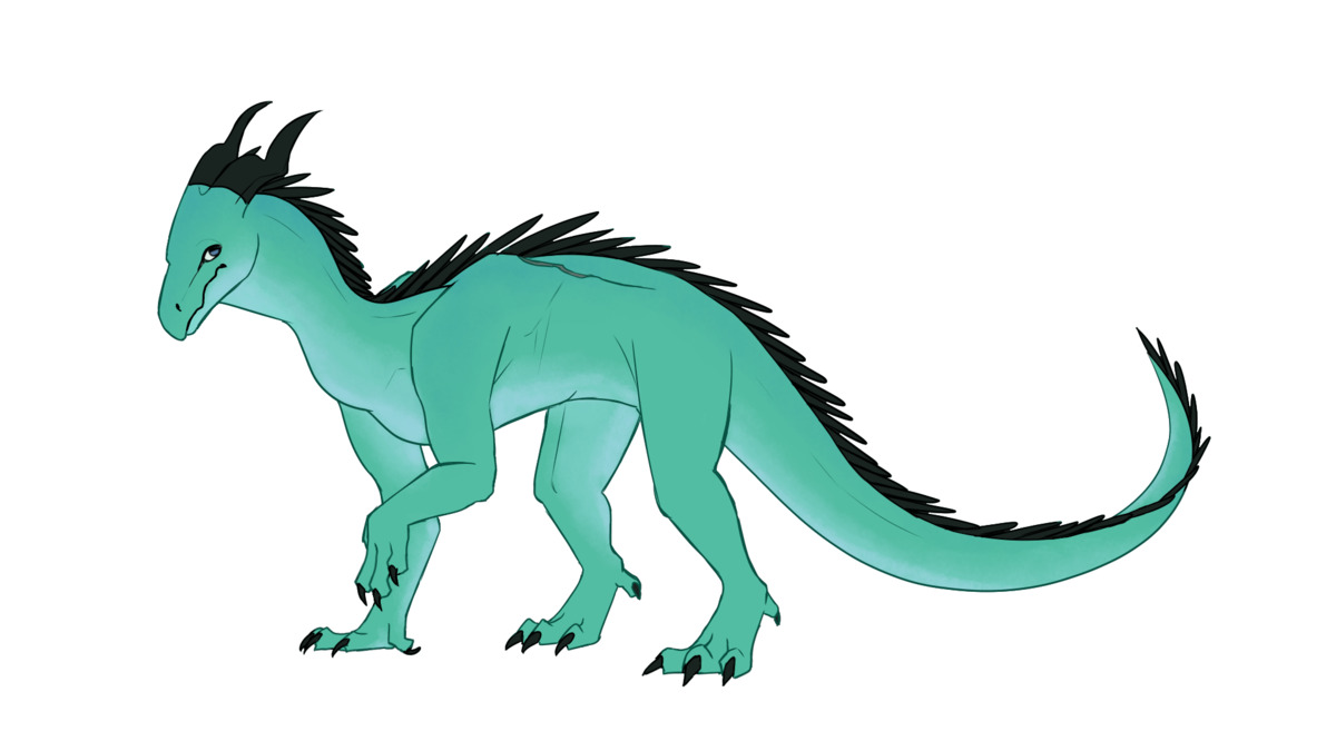
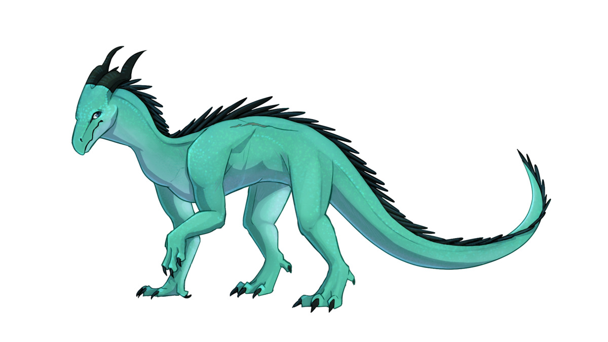
My description of Hequera’s color is…inconsistent. I’ve described her as green, blue, and teal. I imagined her being like this blue/green mix that kind of went either way depending on lighting. My pastel artwork tries to blend green and blue to accomplish this, but Haasio did a much better job by just picking a tone and going with it.
There were a few structural adjustments made in this stage, all regarding her back. Basically just evening out the shoulder bump and making the scar a bit more horizontal rather than rising upward. I feel like the healing work Hequera underwent would have smoothed all that out.
Background
We were at the end with that last shaded piece, and then I realized: I kind of would like a background for Hequera. She deserves it. The only background that really made sense to me for her was like something stony or cavernous. Hequera has an association with that texture for me so it made sense for that to be the background.
So to do this, Haasio used rocky textures from Unsplash as a base. The slate-ish background was of this photo and the stone wall was from this photo.
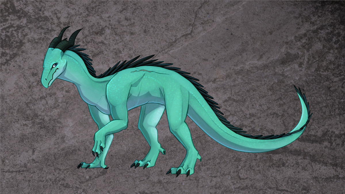
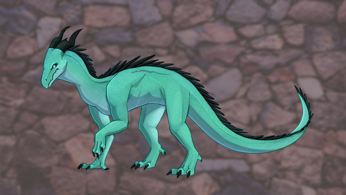
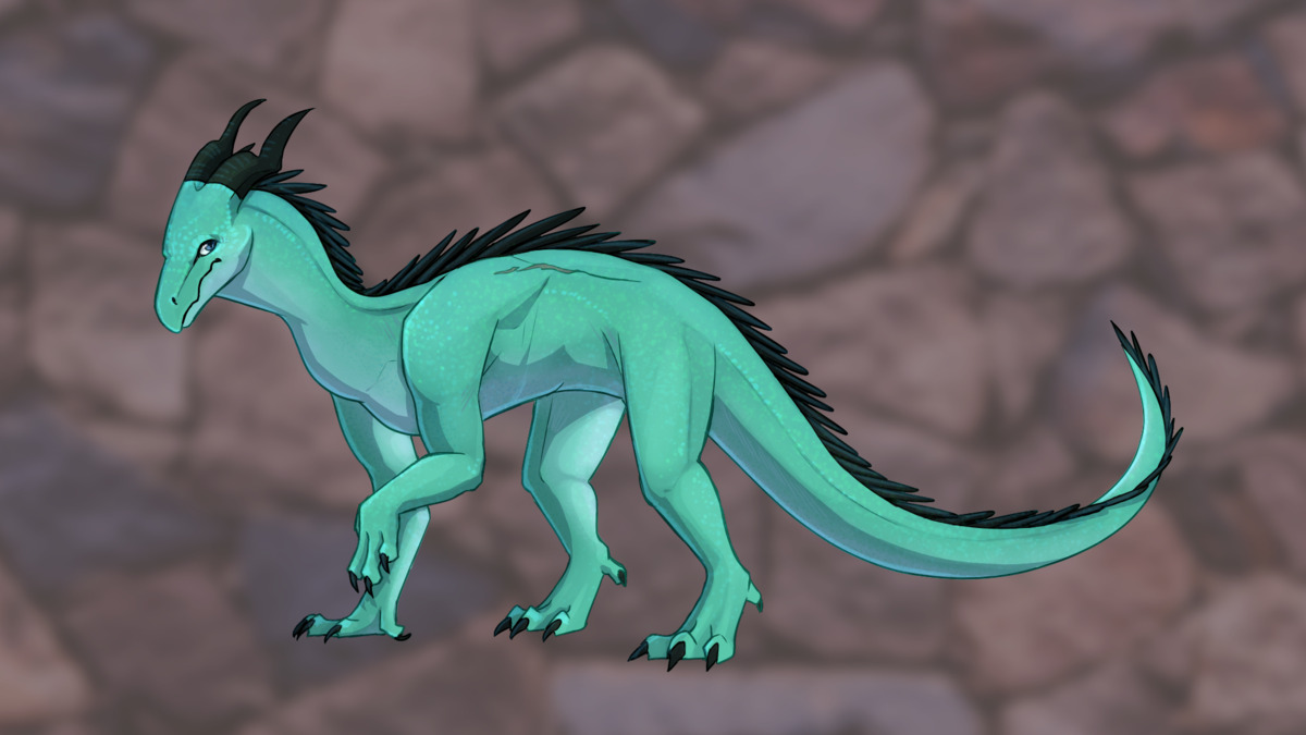
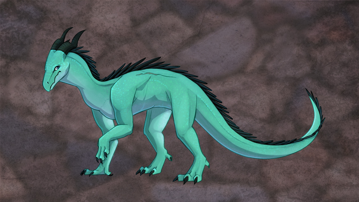
I really liked the slate, but I wanted more like…larger boulder-y chunks to behind her. So the rocky wall one was used, tweaked, and then blended with the slate-ish one to get a mixture that was more what I was thinking. Plus grayer. Which brings us to the final version…
Final

Hequera’s art in its final form! I really like how it turned out. This reminds me of the Rayacha Chajaran commission process because it just…worked so easily and there’s really not much that seems off to me. That’s Hequera! It’s consistent with Dien and brings to life what Hequera looked like with her wings off. I can kind of imagine this version of Hequera on Wolfen, inside the temple-cave, and other settings. It just clicks for me and I’m glad I decided to ask for the background. It brought it all together.
Related/Recent Posts
Crochet Balon
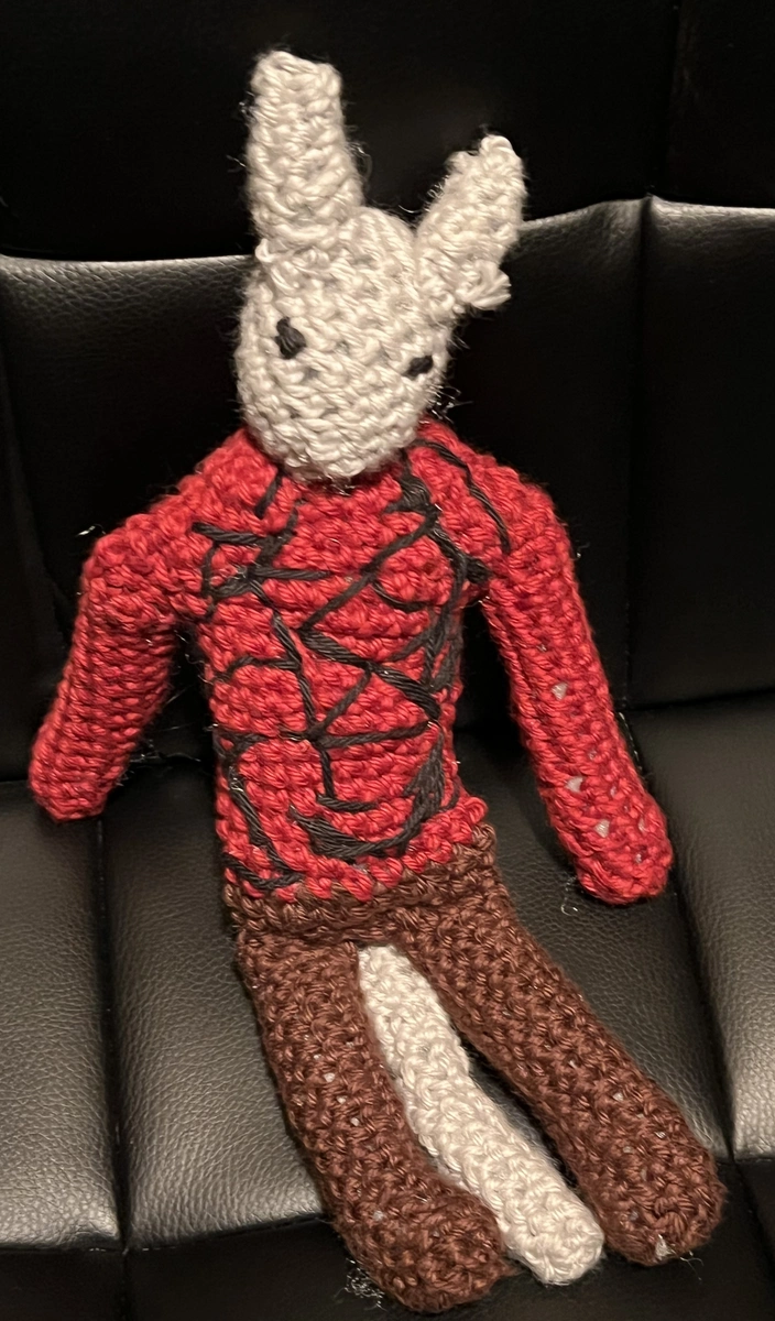
I have finally made another crochet character, this time of Balon. I based the process roughly off of the Chatzu’kuan crochet. I didn’t take proper notes of what I did differently or in general. I made Balon smaller in scale than Chatzu’kuan. She’s kind of buff looking.
September 2024 in Art
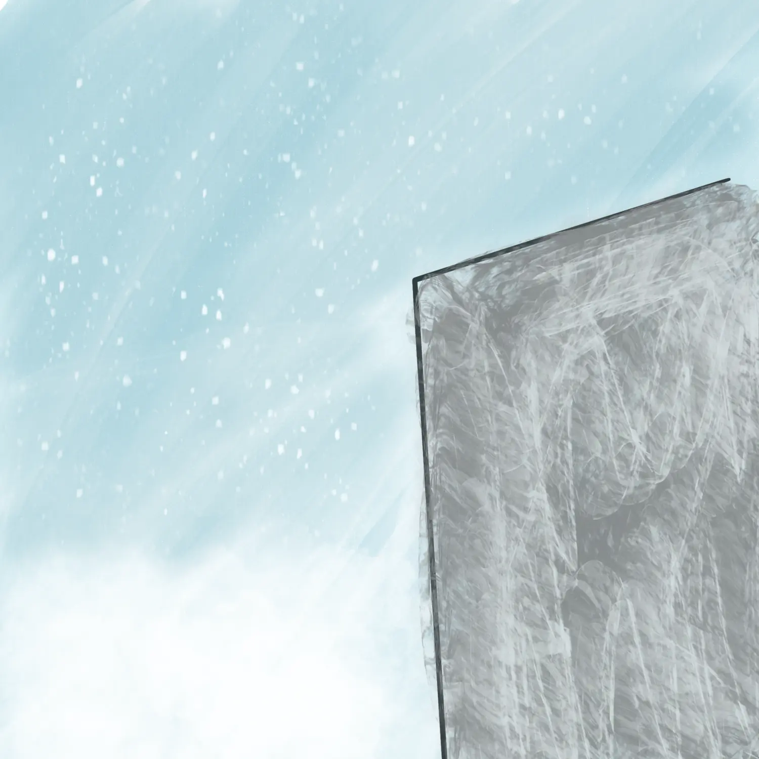
Various pieces of art for/from Volume 2. Played with some new styles and brushes. I overall like the results.

