Commissioned Art of Cyclone!
As King was drawn by Erika Hollice, the same had to be done with Cyclone. The art drove what I wanted out of this commission was this piece of Cyclone looking awesome that I did many years ago. I wanted Cyclone with his Scythe, cape, and dark in a powerful pose. The whole package!
And the whole package includes his helmet. His helmet…well, it’s been an internally contentious point for me since I moved on from LEGO as a primary story medium. Cyclone’s helmet is kind of based off of the old LEGO Knight’s helmet piece. When I started like drawing him or incarnating him, I had to like take what it looked like physically for me as LEGO and turn it into something…well, not. It didn’t start out as angular as it is now, but it developed into it overtime and it just…works. Like it looks like Cyclone to me and trying to like move away from it doesn’t look right at all. But I know it would not look right in reality either. Does it look odd in reality? Absolutely. Would anything else be Cyclone? Absolutely not. So. It is what it is.
But anyway…with that said, let us see how Erika brought Cyclone into life (heh)!
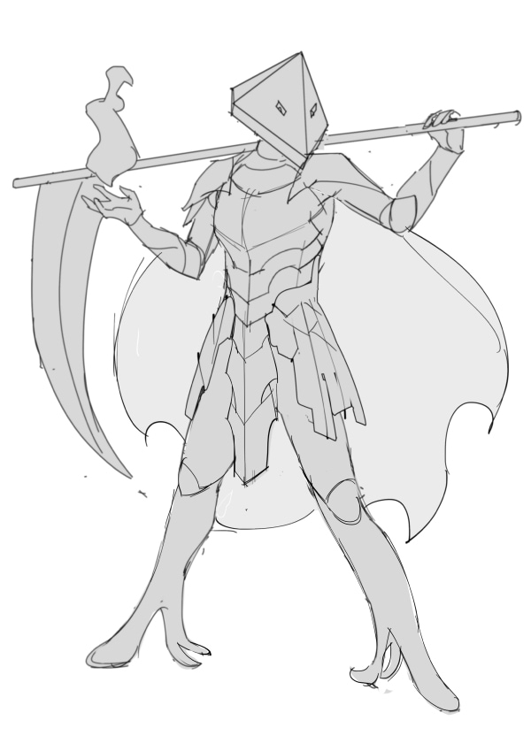
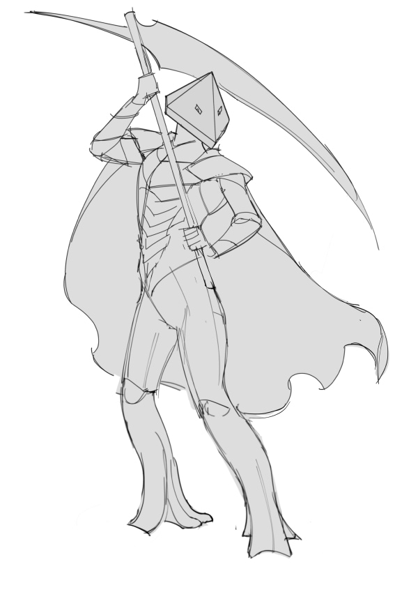
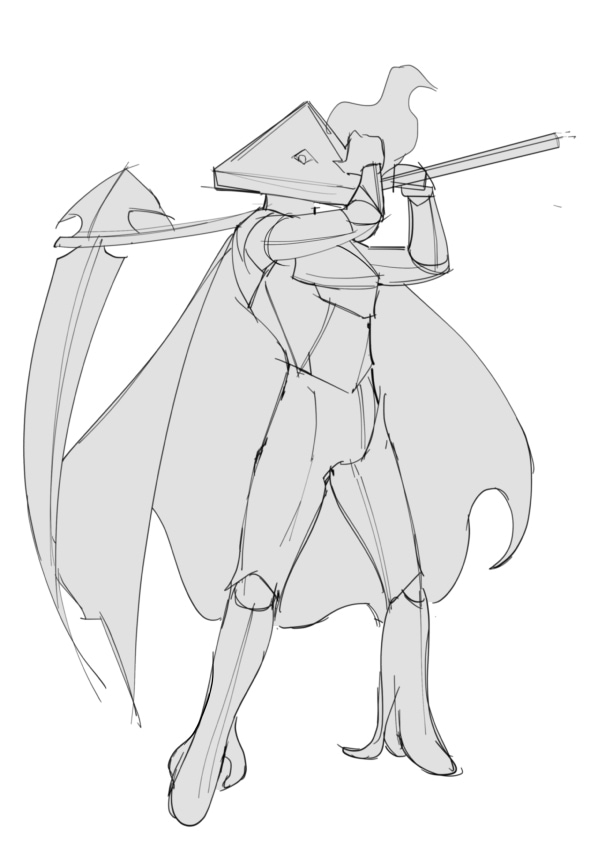
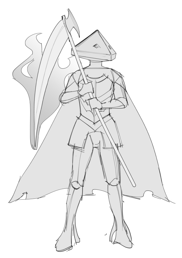
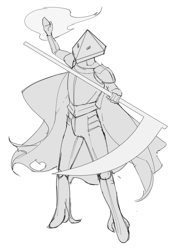
Poses
I wasn’t sold on any of them at first. It was most interested in Pose #1 but parts of the armor didn’t send me. But the helmet was on point! It was kind of weird seeing in like incarnated professionally. I knew it was going to look like that, but still!
As #1 felt the most Cyclone-ish, I decided that it would be the base, with some changes to the legs (Jalon legs are weird), and lower armor.
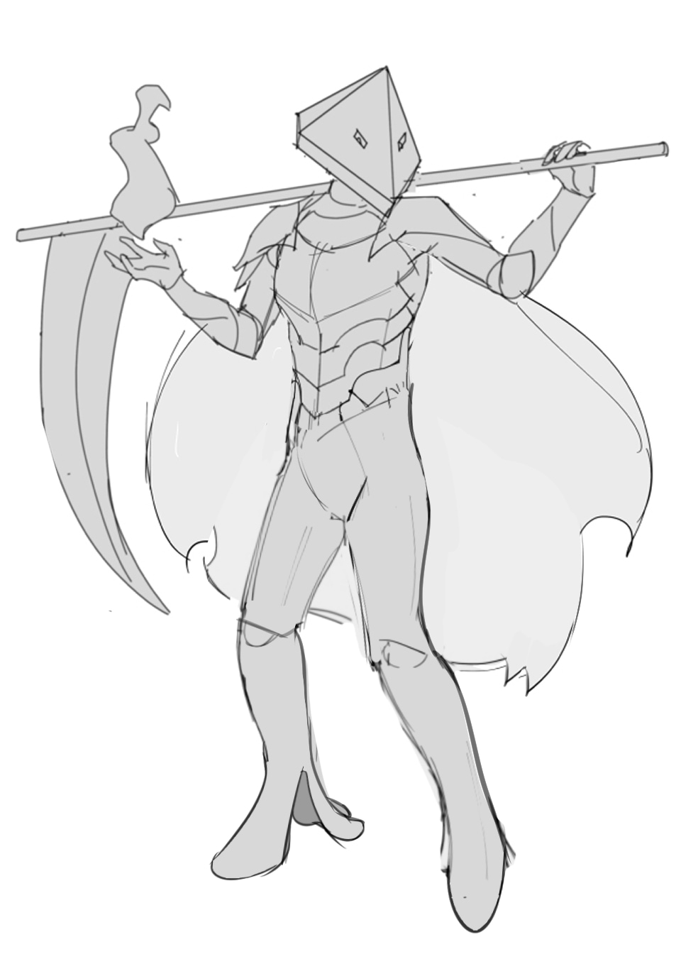
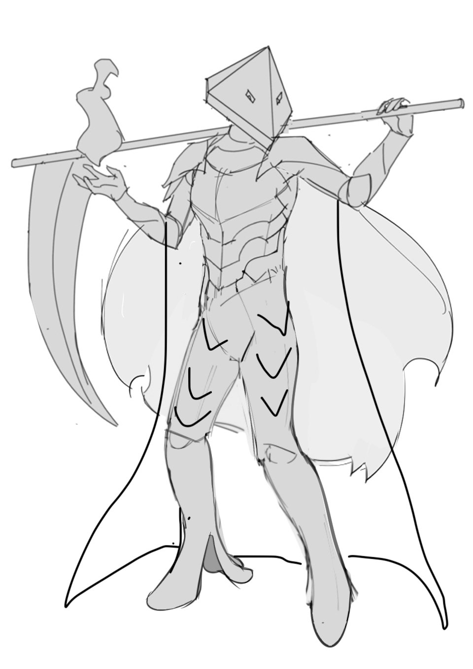
Better! Still had some feedback. The cape shape and the lower armor bits I still wanted some texture to it so it didn’t look like leggings. And making his left leg a bit thicker.
Preview
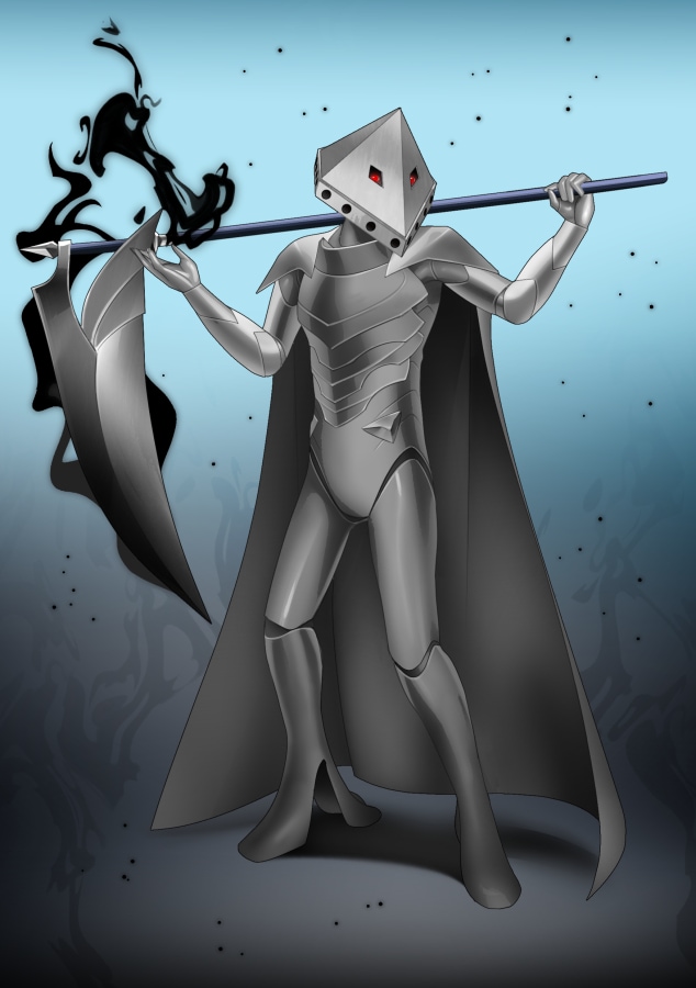
Seeing him in color: the helmet looks perfect! Like yeah, that’s Cyclone. The Scythe was too complicated…the Scythe of the Grim Reaper is literally a basic Scythe. Cape was too dark, but shape was great. Armor on the top nice and legs looked good.
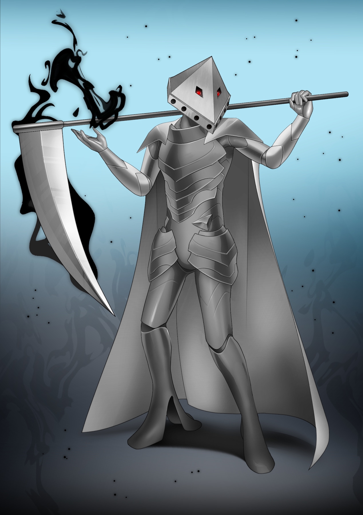
Final

And it all came together! I’m still not 100% on the armor design (specifically the lower torso region and thighs), but it gets me thinking which is always the value in this process. The final Scythe and helmet look wonderful. The legs came out pretty good.
Admittedly, during this process, I was dealing with some intense life stuff so my focus wasn’t there with this as it was with the others nor my heart in it. Even now I’m pretty exhausted so my emotional reaction is muted. Regardless, it turned out very well in the end. As always, Erika did a great job taking a unique character design and putting her spin on it and bringing them into artistic life. Thank you!
Related/Recent Posts
Crochet Balon
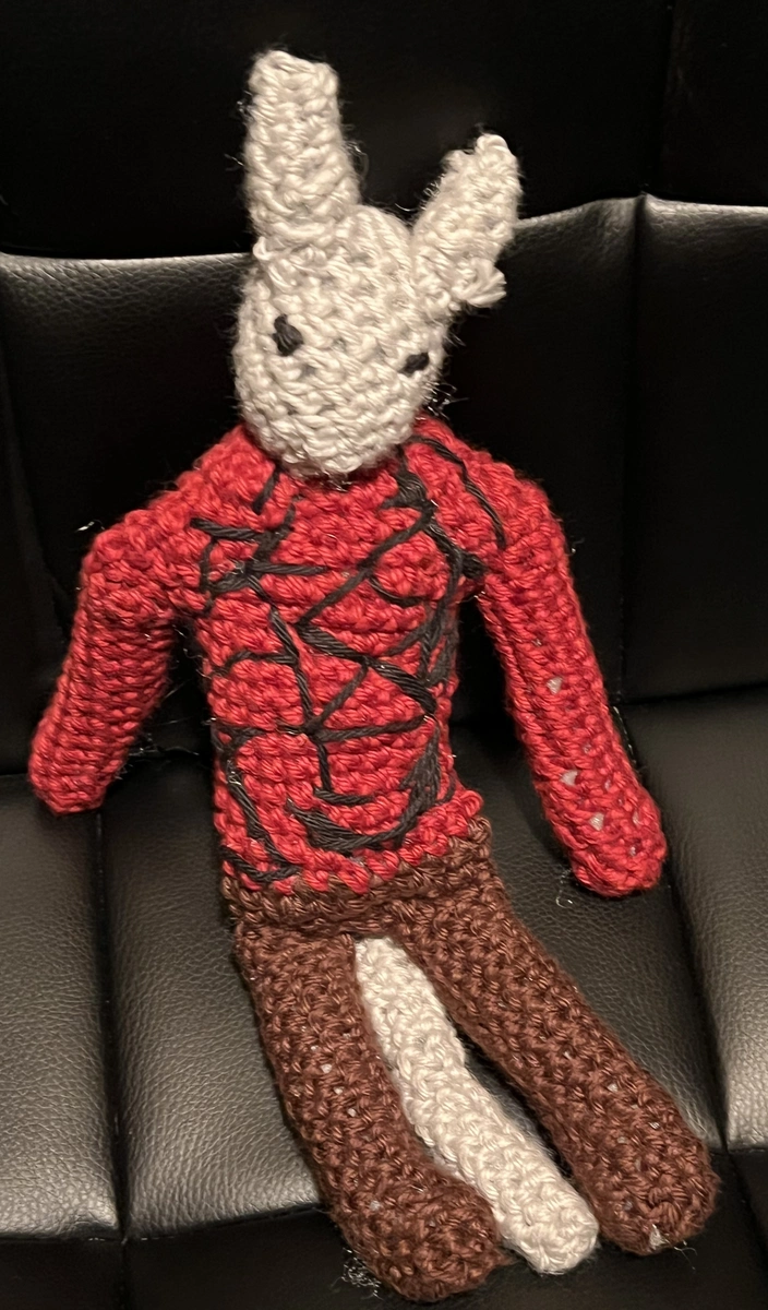
I have finally made another crochet character, this time of Balon. I based the process roughly off of the Chatzu’kuan crochet. I didn’t take proper notes of what I did differently or in general. I made Balon smaller in scale than Chatzu’kuan. She’s kind of buff looking.
September 2024 in Art
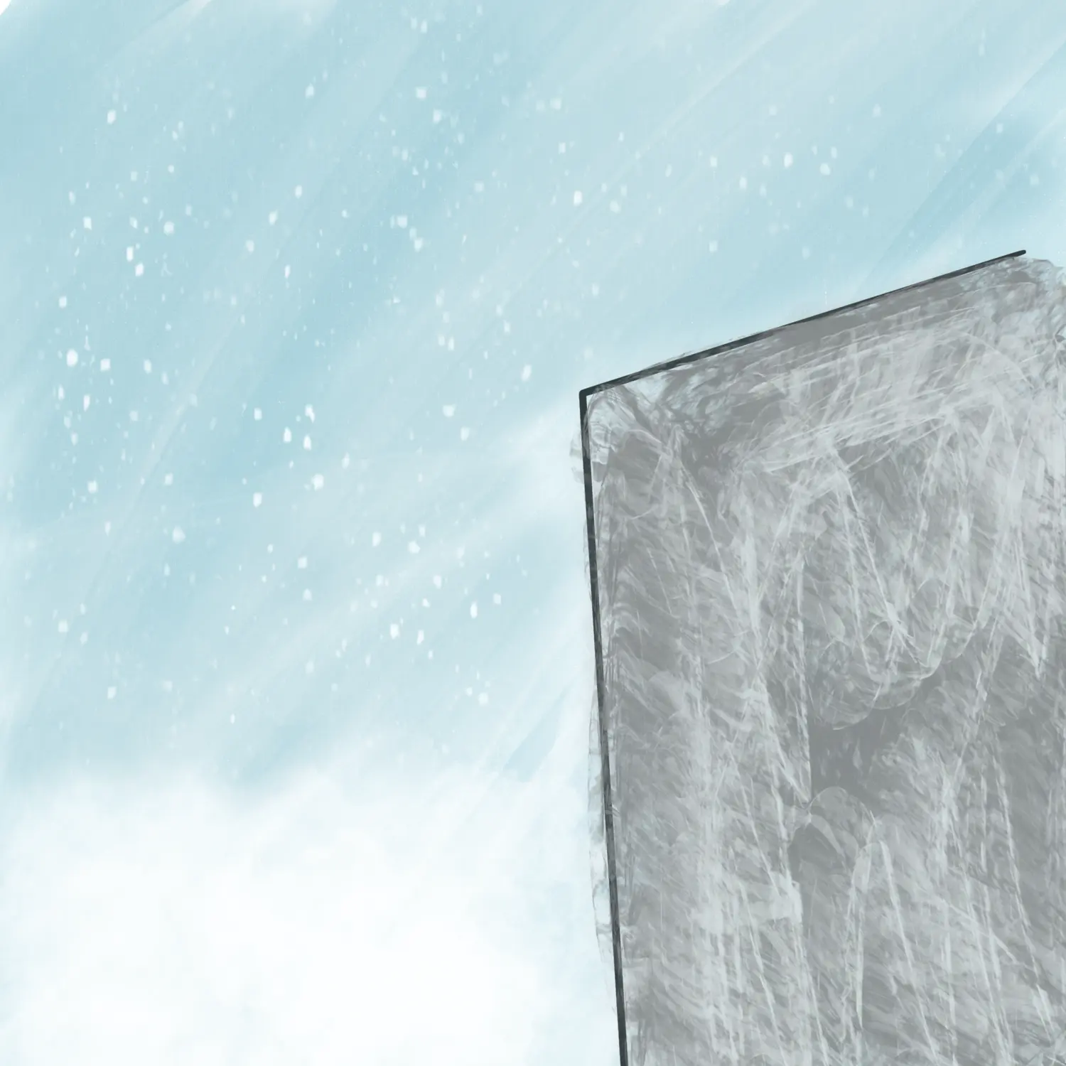
Various pieces of art for/from Volume 2. Played with some new styles and brushes. I overall like the results.

