A More Visual Approach to Book Marketing
Book marketing is probably the most draining aspect of being a self-published author. Writing the book wasn't enough. Now you have to convince everyone else to bother reading it.
Yay.
I really hate marketing. It feels hollow and dishonest. But you know what feeling is worse? No one reading your book. Which, in this era of the book market being extremely oversaturated and increasingly so, is a real possibility. A serious one that you should consider.

So we, as crazy self-published authors, are basically forced into shilling for our product or else our book sales will forever look like the above graph.
And also in this era are the practically hundreds of different ways for you to do that. I am not going to get into a huge analysis of which ways work best or say you should pay money to 'x' service because they have good ratings and people say it is worth it. I hate that philosophy. Paying money to make more money is a tried and true option, but with advertising a self-published book it feels too dangerous. I don't have that much capital, either, so the risk is multiplied for me. I don't think paying money for advertisement is something to be recommended for everyone.
Thus I am left with few options, and even fewer based on my own comfort levels. I don't use Facebook: never have, never intend to. I use G+, Twitter, Deviantart, and Goodreads occasionally. And this blog, but that is...pretty obvious.
I'm going to focus on the second one I listed: Twitter. Twitter was my first social media site, and I really enjoyed it for its 'trendy' style. Which is probably why it is my go to for social-media sharing. It is really easy. There are 'tricks' of course, and I've just been learning about them recently. Although Twitter is based on 140 characters you can bypass that nonsense but just putting the text into an image and having it as a 'photo.' Feels like cheating: don't care.
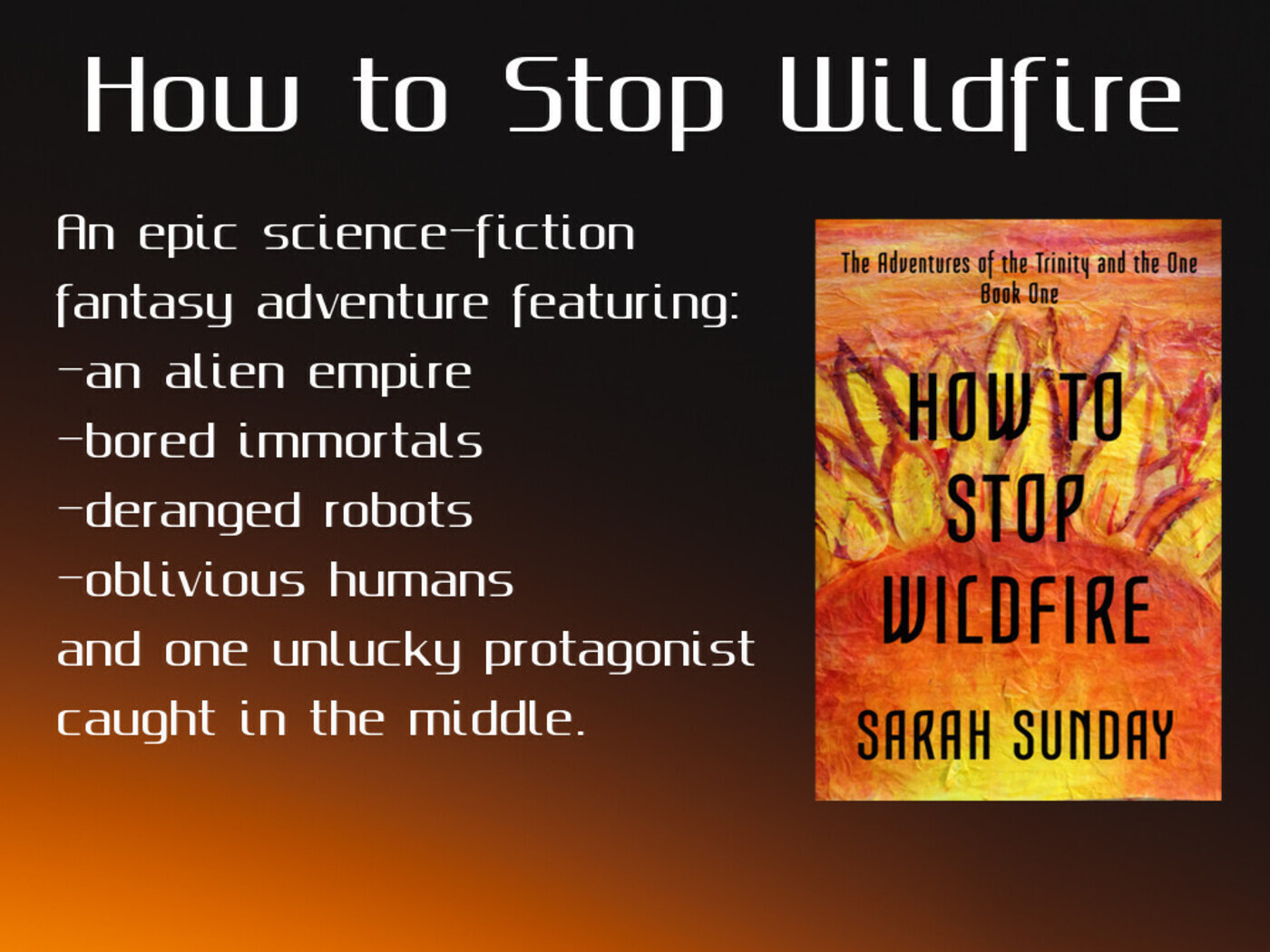
With this 'visual' angle in mind I created this little flyer. If you could call it that. Better word is shameless ad.

Not too bad, in my opinion, but then I know that my standards do not usually mesh with the greater society, especially that of sci-fi/fantasy readers. I am going to be playing with the style and create an updated version later with the new cover art I designed.
I also branched out with gif-making, using this website I found on ProductHunt.

Pretty legit. It is eye catching and flashy. I think it gains interest. Most things advertising related are just images, but I think gifs could potentially work. They have more to draw the eye. I am going to try making more and maybe do quotes or questions. Then in the tweet body have an answer/link to the book or this website.
I don't know if it is 'working' or anything, but I have found that it adds a new touch to book marketing and makes it visually interesting. When people see it they'll at least appreciate that you made something cool and read on instead of just ignoring it and not buy your book anyway. Gotta keep trying.
Some Helpful Websites:
- Pablo by Buffer - Basically create images with text on them and share them quickly. I haven't used it yet, but I have been playing with it. Really cool.
- Slate - the gif-making site that I made the above lovely gif with. Limited, but gets the job done.
- Pexels - Free pictures galore. Has a great selection.
- Product Hunt - For finding more useful sites.
Related/Recent Posts
Sorting the Characters into Hogwarts Houses (Part 3)
This is part three of my Hogwarts Sorting. Here I finally sort some side characters: Marcus, Jessica, Ramulein, Nefertiti, Chatzu’kuan, and Robo-Knight! I don’t think any of these are controversial. These were pretty easy to figure out, all things considered. {% include image-with-text.html src=”posts/hogwarts-houses/Ravenclaw.png” alt=”Ravenclaw House Crest” title=”<h2>Marcus & Jessica - Ravenclaw</h2>” text=”<p>Marcus and Jessica are both unique individuals driven to creative professions. Beyond that, they have shown curiosity and a desire to learn more of the strange world they...
General Empirian Fashion Thoughts

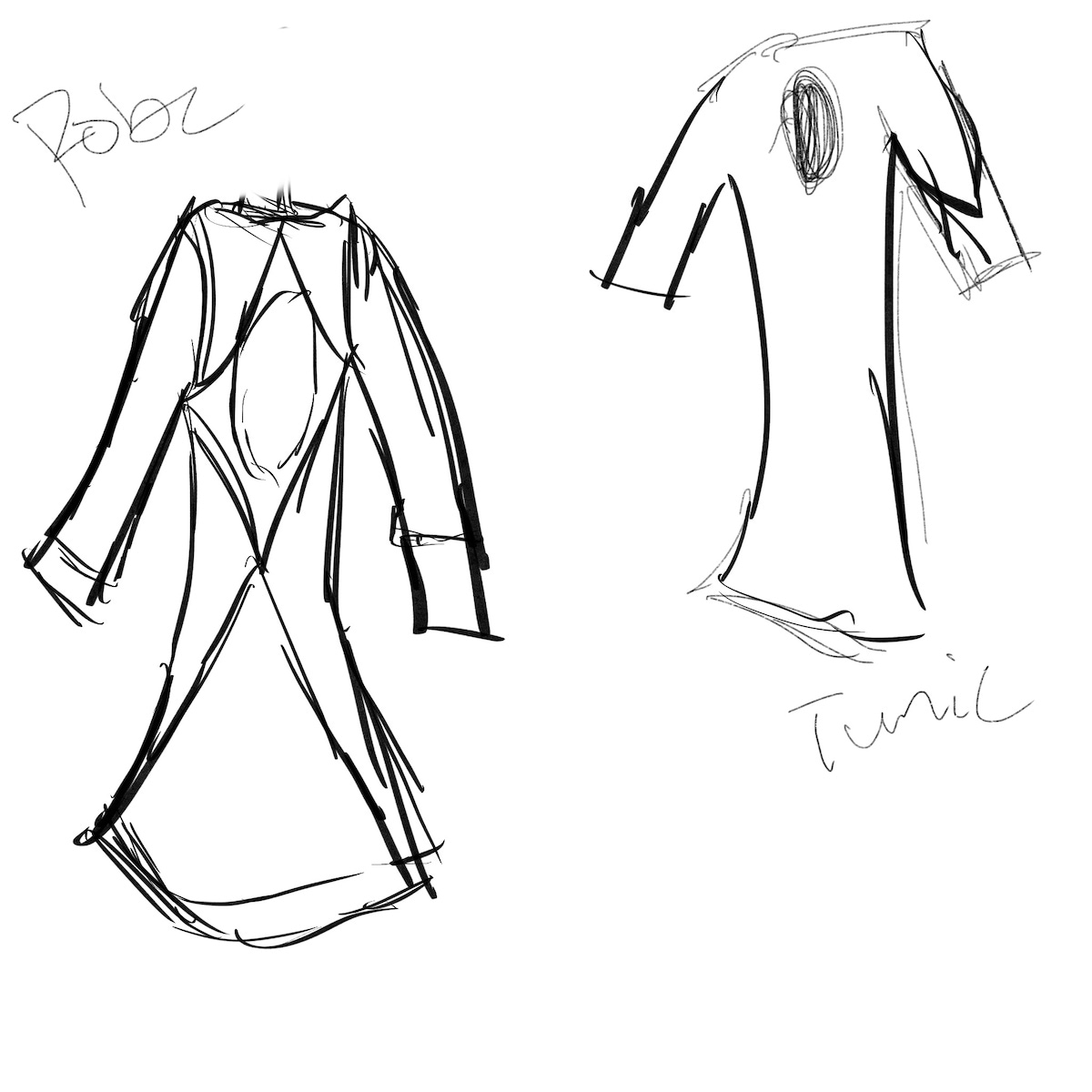
Not everyone in the Empire wears clothes, but for those that do, there are some common themes in fashion. So here I’m going to go through random clothing categories that are prevalent in the Empire and give my current thoughts on them. I’m not going to be going at it race by race, just general impressions on each clothing category. So, anyway, we’re going to start with the big one. Robes! Growing up with fantasy RPGs, robes were a conceptual...
